The options below are shared across the vanilla JavaScript library and the React, Vue, Angular and Svelte components. Code examples below show the value you pass for each option — with the vanilla JavaScript library, pass them as properties of the options object, e.g. intlTelInput(input, { initialCountry: "us" }); with the framework components, pass them as individual props (with the same name), e.g. <IntlTelInput initialCountry="us" />.
Throughout these docs, “iso2 code” means the two-letter country identifier (ISO 3166-1 alpha-2, e.g. "gb"), and “dial code” means the international calling prefix (e.g. +44).
Additional class(es) to add to the injected <div class="iti"> that wraps the input and selected country. Useful for sizing or positioning the whole component.
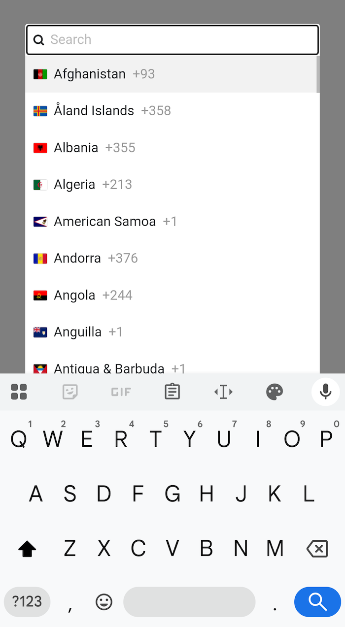
Add a search input to the top of the country list, so users can filter the displayed countries. Matches against country name, iso2 code, dial code, and initials.
View intl-tel-input with this disabled in the Playground.
Controls the country selector — the panel that opens when the user clicks the selected country button, so they can pick a different country.
"DROPDOWN" — render as an inline dropdown attached to the input.
"FULLSCREEN" — render as a fullscreen popup that takes over the viewport. Better suited to mobile / touch devices. See screenshot below.
"AUTO" — pick "FULLSCREEN" on narrow viewports and "DROPDOWN" otherwise.
"OFF" — the country selector is disabled entirely. The selected country is no longer clickable, and there is no arrow is shown.
Note: this replaces the previous allowDropdown and useFullscreenPopup boolean options.
Tip
You can either pass a string literal, e.g. "DROPDOWN", or a constant, e.g. intlTelInput.COUNTRY_SELECTOR_MODE.DROPDOWN — useful where typos in the string literal won’t be caught at compile time.
Try intl-tel-input with this option set to "OFF" in the Playground.
Here’s what the fullscreen popup looks like on mobile:
When using the country selector as a dropdown, sometimes it can get cut-off if an ancestor has overflow:hidden (or similar). You can solve this by setting dropdownParent to another element on the page (e.g. document.body), which means the dropdown will be appended to that element instead of next to the input. It will then be re-positioned next to the input using JavaScript (with position:fixed), so it looks the same as the standard inline dropdown. Note: previously named dropdownContainer.
Match the dropdown width to the input width. When disabled, the dropdown is as wide as the longest country name. Note: previously named fixDropdownWidth.
Try intl-tel-input with this disabled in the Playground.
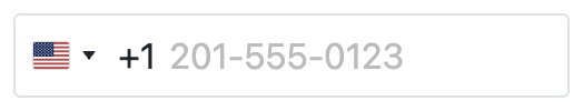
Display the selected country’s international dial code next to the input, so it looks like it’s part of the typed number, but is actually separate (they cannot delete it). This makes it clear to the user which dial code is currently selected and that they are entering their number in international format. Note: previously named showSelectedDialCode.
If the user tries to type a new dial code (as well as the displayed one), we automatically open the country list and focus the search input, so the dial code appears there instead - this way, if they type +54, then Argentina will be highlighted in the country list, and they can simply press Enter to select it, updating the displayed dial code (this feature requires the country selector to be enabled via countrySelectorMode and countrySearch to be enabled).
Display the country flag in the selected country button and next to each country in the list. When disabled, a generic globe icon is shown in place of the selected flag.
Try intl-tel-input with this disabled in the Playground.
An array of iso2 codes that is used to order the country list. Any omitted countries will appear after those specified, in alphabetical order, e.g. setting countryOrder to ["jp", "kr"] will result in the list: Japan, South Korea, Afghanistan, Albania, Algeria, etc. Note: this replaces the legacy preferredCountries option, which has now been removed, but you can still re-create the grey divider below the preferred group with a single CSS rule.
Set the initial country selection by specifying its iso2 code, e.g. "us" for the United States. If left unset (and no initialCountryLookup is provided), the input starts in the empty/globe state. Note: however you use initialCountry, it will not update the country selection if the input already contains a number with an international dial code.
View intl-tel-input with initialCountry set to "de" (Germany) in the Playground.
Warning
Only set this if you’re sure of the user’s country. If set incorrectly and the user auto-fills their national number and submits without checking, the number can pass validation but be stored with the wrong dial code.
Provide a custom function that calls a lookup service (e.g. an IP geolocation API) to determine the user’s country, and returns a Promise that resolves with the relevant iso2 code (or rejects on error). The lookup only runs when initialCountry is not set — an explicit initialCountry always takes precedence. Note: previously named geoIpLookup.
Here is an example using the ipapi service* (assign this to initialCountryLookup):
async () => {
  const res = await fetch("https://ipapi.co/json");
  const data = await res.json();
  return data.country_code;
}
Tip: store the result in a cookie to avoid repeat lookups!
Note
*The ipapi service used in the example above (and across this site) has a limited free tier that stops working once its quota is reached. For production, you should either sign up for a paid plan, swap in another IP-lookup provider, or roll your own solution — the core library just cares that the returned promise eventually resolves with an iso2 code (or rejects).
Note
On initialisation, a Promise is exposed via the promise property on the core library instance (accessible directly with the vanilla JavaScript library, or via a ref in the framework components), so you can await it to know when initialisation requests like this have completed.
Automatically format the number as the user types. This feature will be disabled if the user types their own formatting characters. Requires the utils script to be loaded. Note: previously named autoFormat.
Try intl-tel-input with this disabled in the Playground.
Controls how numbers are displayed in the input — both the auto-generated placeholder example and any stored value passed in on initialisation or via setNumber.
"INTERNATIONAL" (default): formatted with the dial code, e.g. +44 7740 123456.
"NATIONAL": formatted in the country’s national format (no dial code), e.g. 07740 123456. Forced back to "INTERNATIONAL" if separateDialCode is enabled (since the dial code is then part of the typed number) or if the country selector is enabled without flags or a separate dial code (since the user has no way to see the country).
"E164": standardised international format with no formatting characters, e.g. +447740123456.
Note: this is a dev-facing preference for displaying existing numbers. It does not override what the user types — if they type a number in national format, it stays in national format. To extract the full international number regardless, use getNumber. Requires the utils script to be loaded (otherwise no formatting can happen and the value is shown as-is). Note: previously covered by nationalMode and formatOnDisplay options (now removed).
Tip
You can either pass a string literal, e.g. "INTERNATIONAL", or a constant, e.g. intlTelInput.NUMBER_FORMAT.INTERNATIONAL — useful where typos in the string literal won’t be caught at compile time. (Note: only E164, INTERNATIONAL, and NATIONAL are accepted here — RFC3966 is rejected.)
Try intl-tel-input with separateDialCode disabled and numberDisplayFormat set to "NATIONAL" in the Playground.
As the user types (or pastes) in the input, ignore any irrelevant characters (e.g. letters). The user can only enter numeric characters and an optional plus at the beginning. Cap the length at the maximum valid number length (this respects allowedNumberTypes). Requires the utils script to be loaded.
strictMode would silently drop rejected input, so by default we surface that to the user via strictRejectAnimation, which plays a built-in shake/flash animation. For richer feedback (e.g. a toast explaining why input was rejected), listen for the strict:reject event (or use the equivalent onStrictReject / strictReject callback in the component wrappers). For a live example, try typing an alphabetic character in the telephone input on the homepage, which uses a Bootstrap toast.
When strictMode is enabled, play a subtle animation any time a keystroke is rejected, or a paste is rejected entirely — a brief shake by default, or a background-colour flash for users with prefers-reduced-motion. Partial paste sanitisation (e.g. only some characters stripped) does not trigger it. The flash colour can be customised via the --iti-strict-reject-flash-color CSS variable.
Customise the placeholder text. Your function receives the example number (used as the default placeholder), along with the selected country data, and whatever string you return is used as the placeholder instead.
For example, the snippet below masks each digit with an X, or falls back to "Enter number" when no country is selected:
When no country is selected (globe state), exampleNumber is an empty string and selectedCountry is null, so remember to guard against null when reading properties off it.
View intl-tel-input with this enabled in the Playground.
You can either pass a string literal, e.g. "POLITE", or a constant, e.g. intlTelInput.PLACEHOLDER_POLICY.POLITE — useful where typos in the string literal won’t be caught at compile time.
Play with this option on an input that contains a placeholder in the Playground.
Set the number type to use for the generated placeholder numbers. We strongly recommend sticking to "MOBILE" (the default), "FIXED_LINE", or "FIXED_LINE_OR_MOBILE" — these are the only types with an example number for every country. Other values produce an empty placeholder for any country where libphonenumber has no example (e.g. "PAGER" only has examples for ~9% of countries).
View intl-tel-input with this set to "FIXED_LINE" in the Playground.
Tip
You can either pass a string literal, e.g. "MOBILE", or a constant, e.g. intlTelInput.NUMBER_TYPE.MOBILE — useful where typos in the string literal won’t be caught at compile time.
Set the number type(s) to enforce during validation, as well as the maximum number length to enforce with strictMode. Set it to null to not enforce any particular type (not recommended*).
By default, it’s set to ["MOBILE", "FIXED_LINE"] so isValidNumber (etc) will only return true for those kinds of numbers. Alternatively, you could set it to simply ["MOBILE"] if you only wanted to accept mobile numbers as valid. Note: previously named validationNumberTypes.
*It’s best to be as specific as possible, rather than using the catch-all value of null. isValidNumber works by checking the number’s length, and some number types allow very short lengths. For example, Norwegian mobile and landline numbers are 8 digits long, so by default that’s the only valid length. But Norwegian UAN numbers can be only 5 digits long, so if you set allowedNumberTypes to null, validation will pass for any number that is 5-8 digits long.
You can also pass constants, e.g. allowedNumberTypes: [intlTelInput.NUMBER_TYPE.MOBILE, intlTelInput.NUMBER_TYPE.FIXED_LINE] — useful in plain JavaScript where typos in the string literal won’t be caught at compile time.
Whether or not the validation methods return true for numbers containing extensions, e.g. “+1 702 123-1234 ext. 1234”.
Try toggling this option on/off on a number with an extension in the Playground.
Note
Not compatible with strictMode (which is enabled by default), as that will prevent the user from typing the extension in the first place. Disable strictMode to allow extensions to be entered.
Note
getNumber defaults to E.164 format, which strips the extension. Use getExtension to retrieve it separately, or call getNumber with "INTERNATIONAL", "NATIONAL", or "RFC3966" — those formats include the extension.
Whether or not the validation methods return true for numbers containing phonewords, e.g. “+1 702 FLOWERS”.
When processing phoneword numbers, the core library will automatically convert them to digits e.g. via getNumber, or when initialising the core library on an input containing a phoneword number.
Note that the number must contain at least 3 letters for them to be treated as phoneword digits — fewer are treated as typos and stripped before validation. So e.g. +44 7947 123ABC becomes +44 7947 123222 (valid), but +44 7947 1234BC becomes +44 7947 1234 (invalid — too short).
Note
Not compatible with strictMode (which is enabled by default), as that will prevent the user from typing letters in the first place. Disable strictMode to allow phonewords to be entered.
The locale to pass to Intl.DisplayNames to generate the country names. Should adhere to the BCP 47 standard, e.g. "zh" (Chinese), or "zh-Hans" (Simplified Chinese). To override individual country names, see countryNameOverrides below. For translating the other UI strings, like the country search placeholder, see uiTranslations below. Note: previously named localizedCountries.
Note: some browsers lack Intl.DisplayNames country-name data for certain locales (e.g. desktop Chrome lacks Armenian etc). For those locales we bundle a fallback via the uiTranslations option - see Browser support caveat.
Override individual country names, keyed by iso2 code. Useful when the name produced by countryNameLocale doesn’t match your preferred wording. Example use:
{
  us: "United States of America",
}
View intl-tel-input with the US renamed to “United States of America” in the Playground.
Translate the core library’s UI strings (country search placeholder, no-results message, ARIA labels). For translating country names, see countryNameLocale above; to override individual country names, see countryNameOverrides.
We ship translations for 54 locales, named using the BCP 47 standard — import one and pass it in as the uiTranslations option:
import { fr } from "intl-tel-input/locale";
See the Localisation docs for overriding individual keys, defining custom translations, and the full list of translatable keys. Note: previously named i18n.
View intl-tel-input in Ukrainian in the Playground.
Allows the creation of hidden input fields within a form, which, on submit, get populated with (1) the full international telephone number and (2) the selected country’s iso2 code. This is useful for old-fashioned, page-load form submissions to ensure the full international number and iso2 code are captured, especially when numberDisplayFormat is "NATIONAL" or separateDialCode is enabled. See example.
This option accepts a function that receives the name of the main telephone input as an argument. This function should return an object with phone and (optionally) country properties to specify the names of the hidden inputs for the phone number and iso2 code, respectively.
Note
This feature requires the input to be inside a <form> element, as it listens for the submit event on the closest form element. Also note that since this uses getNumber internally, firstly it requires the utils script to be loaded, and secondly, it expects a valid number and so will only work correctly if you have used isValidNumber to validate the number before allowing the form submit to go through.
This is one way to lazy load the included utils.js (to enable formatting/validation, etc) - see Loading The Utils Script for more options.
The loadUtils option takes a function that returns a Promise resolving to the utils module. You can import the utils module in different ways (examples below): (A) if you use a bundler like Webpack, Vite or Parcel, you can import it directly from the package, or (B) from a URL, either a CDN or your own hosted version of utils.js. Note: this replaces the utilsScript option (now removed).
(A) with a bundler, import the utils module directly from the package
// modern bundlers will split this out into a separate chunk and fetch it only when needed
() => import("intl-tel-input/utils")
(B) import utils module from a URL (CDN or your own hosted version)
The module is only loaded once the core library initialises, and additionally, only once the page has finished loading (on the window load event) to prevent blocking (the script is ~260KB). The promise property on the core library instance resolves once loading is complete — see Utils Script for more information.